
B A C K S T O R Y
Ever since the age of 15 in the mid 1970s I wanted to be an assignment illustrator. I wanted to be Roger Huyssen and do the next great Boston album cover or Doug Johnson and do Time magazine covers. Well to my amazement I've actually been able to live that dream. Doing artwork for the US Open and the World Series may not be as completely iconic as doing art for 70s arena rock bands but hey, I'm gonna take it any day of the week. Fast forward 25 years and some aspects of the assignment illustration paradigm really don't get better with age. That is why I'm looking at a new way of being an artist. I think it will be fun to make my art more directly for people instead of companies and myself instead of a boardroom full of marketing execs.
These prints I'm offering are my personal artistic statement about what I feel makes great design and it's connections to places we all love. That's why I've decided to start to selling these works on a more personal limited edition and signed basis. I hope my images strike a chord with you and give you just a little more pride of place in this area we call home. N E O!
“It all began with endless drawing of racing cars, dragsters, european lemans sports cars, Hot Wheels, and Revel models. If it had racing slicks and chrome I was going to draw it over and over, until I had it perfected. ”
After graduating from my hometown university in Akron, Ohio (think Black Keys) I worked as a graphic designer in advertising agencies in both North Eastern Ohio and Charleston South Carolina. While I enjoyed the design work I was doing I felt that Illustration and specifically airbrush illustration with typography was what I really wanted to do with my talents.
In the late 80s I quit my last in-house job and went out on my own free-lancing for the first time doing advertising layouts for local ad agencies. In 1991 I placed my first national advertisement featuring my airbrush art in a sourcebook for illustrators called the workbook and the jobs came calling in from all over the country (no email). My style at the time was highly tonal with airbrush gradations delineating my streamlined shapes. This style really hit the spot for high-tech clients like Oracle, Apple, and Novell. I continued this style for about ten years tediously mixing paint and cutting frisket masks to paint my illustrations that were then physically shipped out to the client in large flat cardboard folders.
In the mid 90s the writing was on the wall that digital illustration was coming like it or not. The greatest benefit to digital illustration beyond command Z (undo) was the fact that breathing atomized paint was no longer necessary to make a living. At the turn of the century after teaching myself to paint in a new digital technique that I invented, I cleaned my last airbrush for the last time and set out again to build a new digital clientele. This time my new style attracted art directors who were looking for a more classic mid-twentieth century poster style. This suited me just fine because my some of my most early influences were artists of that era such as Britain's Tom Purvis, Germany's Joseph Binder, and America's Otis and Dorothy Shepard.
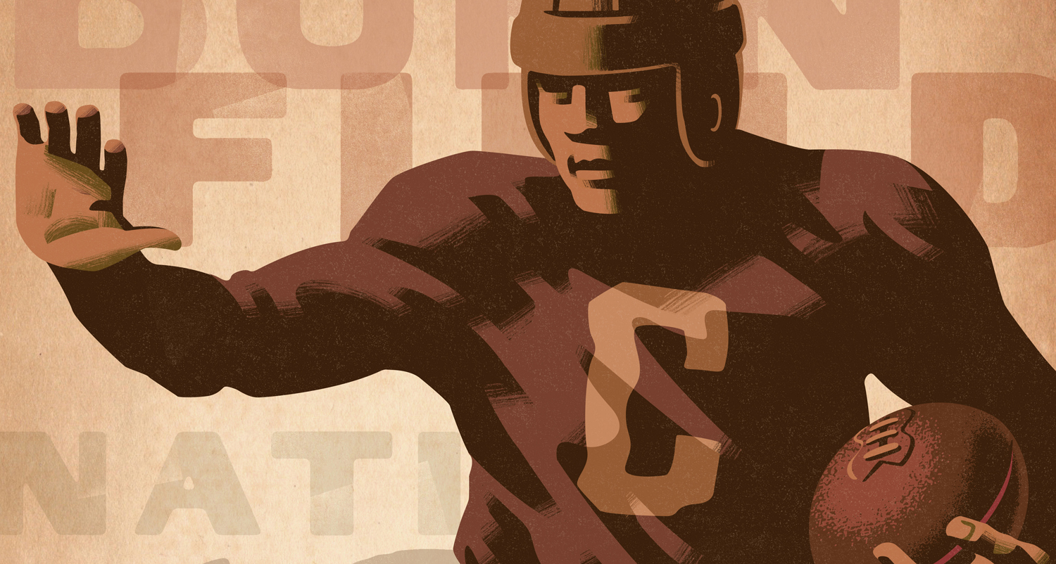
For the last ten years my career has taken a turn toward assignments for large athletic events and modern travel and graphic event posters. Including everything from the U.S. Open and the Davis Cup to the World Series and the NHL's Winter and Heritage Classics. To see more of my commercial work check out...... jonclundillustration.com
All this time and experience has led to this work for my Lund Studio, my most focused statement on what makes a compelling and inspirational poster for your home.
“I like the challenge of taking an area or landmark that you’ve seen a hundred times, that has become just everyday scenery. Looking at it in a new way, and creating an iconic image that
will allow people to reconnect with the amazing places that surround them everyday.
”